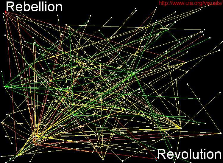
The purpose of this page is to help you create your own lively information maps using our databases.
Natural Creations: Just sit back and let your JAVA map develop in its own way. Occasionally zoom in or out (Page Up or Down) or move Up, Down, Left or Right using the arrow keys (your mouse pointer has to be above the applet area). The natural tensions in the network of springs will position the nodes and eventually come either to rest or to perpetual movement. The structure you will see has not been pre-defined. Sort of natural creation, isn't it?


Colours: When choosing link colours in the drop-down menus below the applet, bear in mind what background colour are you going to use. For example, you should not use yellow springs on white background. You can toggle the background color between black and white using the "Toggle Background" button. Usually, only the first three or four rings will show in the map (depends on the number of them that is displayed -- usually not more than 600).
Spring Lengths: Play with the spring lengths. If you choose lengths that are smaller with each ring (e.g. long, short, very short, very short, ...), your maps will be flower-like, clear to read. If the link lengths are equal (or increasing), you will get a chaotic picture, although not without a certain charm.
Labels: Approaching any node in the map brings up its label. If it happens to be a central node, all children nodes will switch on their labels as well. If you want to keep a label on, press SHIFT + right mouse button (RMB). Increase and decrease the font size to improve readability.
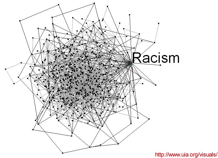
Example: Log in here, then (in the Database Menu) choose the database of World Problems (it will get a green background). Then type "racism" as a keyword in the search bar and press "Submit Query". You will get a list of database profiles about racism. Choose the first one, called simply "Racism", and you will get into that profile. You will see several labels in red that may or may not contain text or links. In order to create a spring map, choose one of the "map" links next to the link labels. Maps of agravating relationships tend to provide the most visually attractive images. For a particular image, select black, gray, gray colours, then medium, short, very short lengths, and 600 links ... and click on the "Redo map" button. In a while you will see a particularly grim spidery visual version of racism... like this one:
